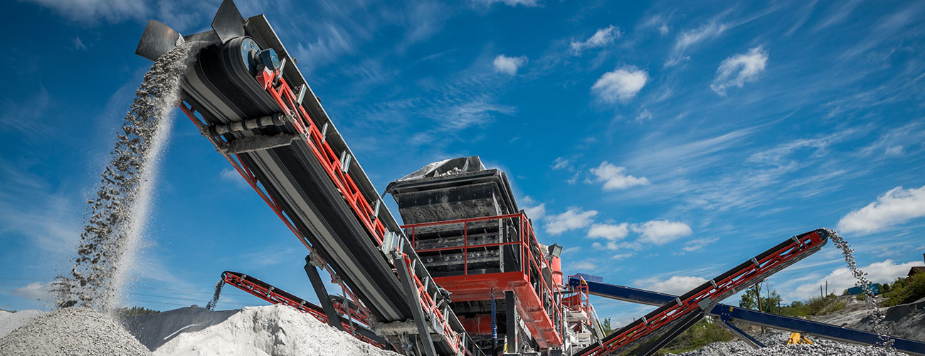
MMG is a rapidly developing group of companies specializing in mining, processing and trading mineral resources. As a result of the Group’s carefully planned policy of acquisitions, MMG has built a chain of complementary companies prompting a need to blend apparently unconnected brands and create a new visual identification for the Group.
TAILORS Group was asked to support the MMG Group in this process, in particular to create the underlying concept for brand communication and to make MMG recognizable as a powerful, diversified group with an industrial profile. A further step was to create its core communication tools, starting with a website and printed materials.
Applied solutions
The name used thus far, Minerals Mining Group, was replaced by its abbreviation, MMG, which on the one hand emphasizes attachment to the Group’s history but on the other is no longer associated with just one line of business, i.e. mining. The abbreviation MMG was also added to the names of all its subsidiaries, emphasizing the Group’s consolidation. A family of similar names creates a clear structure and enables easier identification of each one of the company’s lines of business.
A challenge the project faced was to prepare a concept for the implementation of a new visual identity without wasting the upside of the high level of awareness of the legacy brands. Thus, one element of rebranding consisted of an educational campaign targeting clients and partners. The aim was to make a smooth transition from the legacy names and graphic solutions to a completely new corporate identity system.
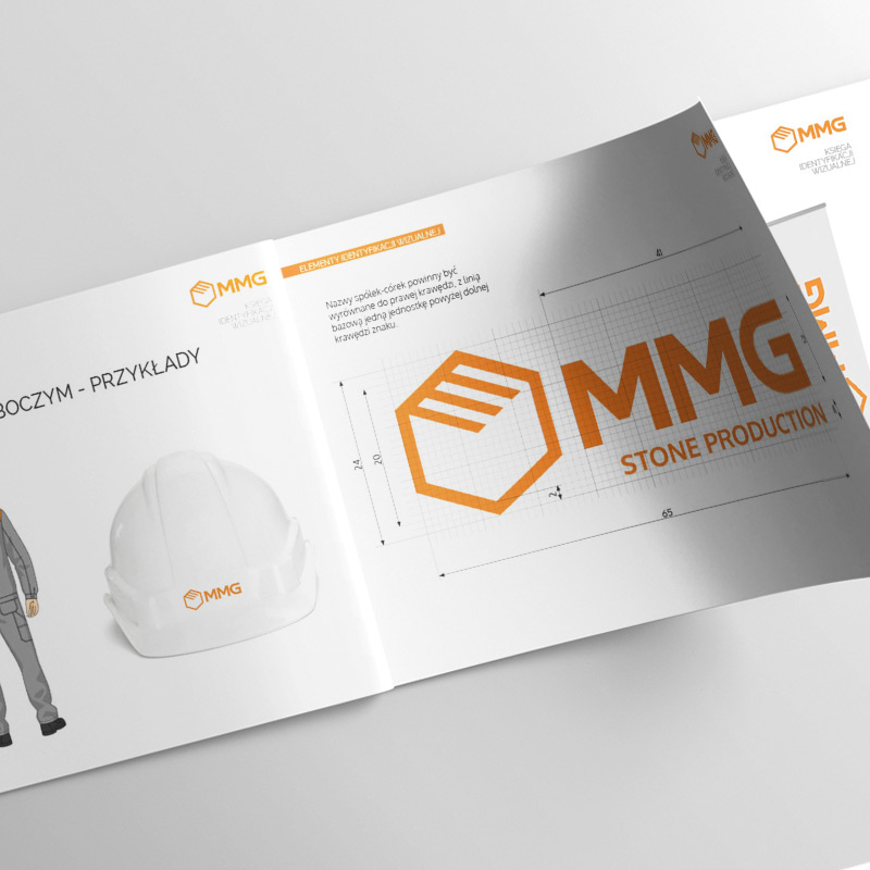
A key element of the new visual identity is the logo whose colors and typography underline professionalism and modernity with a simultaneous attachment to tradition. The logo’s signet refers to a block of stone as the raw material at the center of the Group’s business.
The form of an ideal cube is a metaphor for the perfection and craftsmanship required to work in stone as well as a symbol of integrity and robustness. The symbol used in the logo also evokes associations with the Group’s lines of business, comprehensive operations and relations with business partners.
The visual identification system has been codified in a logotype book which, apart from the basic list of elements, also includes markings of buildings, mines, vehicles, work clothing and machinery.
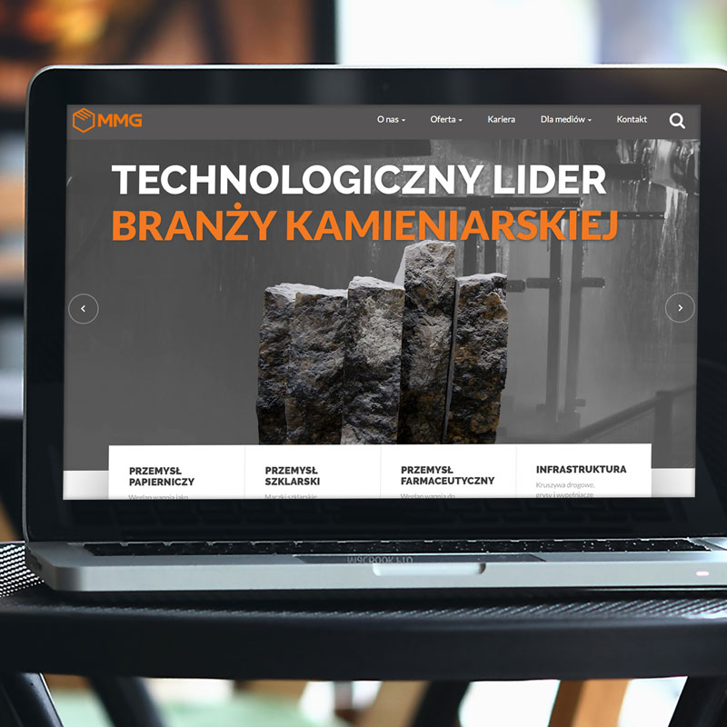
An important element of the rebranding project was the creation of websites (corporate website and product pages). The combination of the TAILORS Group’s technological competences and wealth of experience in working for the raw materials industry was extremely valuable.